Applied Statistics, Exploratory Data Analysis (EDA) On An Insurance Dataset To Find Valuable Insights

An insurance dataset contains the medical costs of people characterized by certain attributes. It has 1338 records of people with 7 attributes, which are:
1. age: Primary beneficiary
2. sex: Gender of insurance contractor (male, female)
3. bmi: Body mass index for an understanding of body whether it is high or low relative to height, objective index of body weight in kg/m^2 using the ratio of height to weight. Ideal values 18.5 to 24.9.
4. children: Number of children covered by health insurance (number of dependants)
5. smoker (yes/no)
6. region: The beneficiary’s residential area in the US, northwest, southwest, northeast, southeast.
7. charges: Medical costs billed by health insurance for the individual.
Python 3 has been used to execute code in this case study.
Another case study: Number images classified using neural network and k-nearest neighbor algorithm.
Import the necessary libraries.
%matplotlib inline
import numpy as np
import pandas as pd
import scipy
import matplotlib.pyplot as plt
import seaborn as sns
sns.set(color_codes=True)
pd.options.display.max_columns = None
Read the .csv file as a pandas dataframe.
I kept the CSV data file inside my project directory and executed the following code to fetch the data into a variable.
data = pd.read_csv("insurance.csv")
Utilize the head function on the variable to check whether the data has been fetched successfully or not.
data.head()
It returned the top 5 rows from the dataframe as shown below.
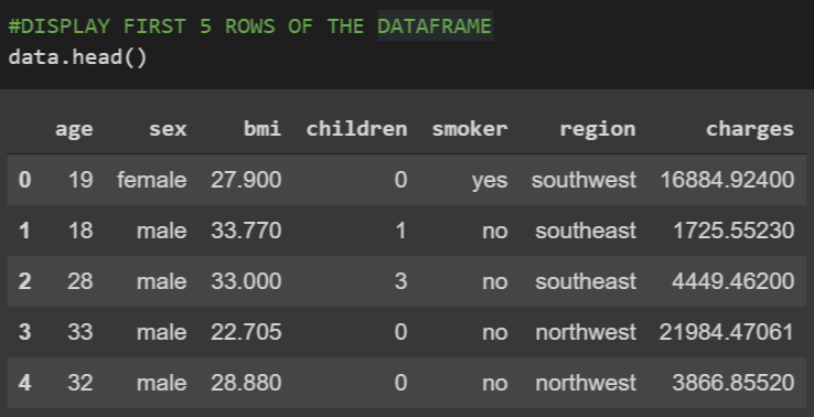
Check the shape of the data.
(1338, 7)
To proceed with understanding the data, the data attributes or the dataframe columns have to be understood clearly. These are the dimensions and they define the location of each data point in the mathematical space.
Starting with checking the data type of each column, the data types are not same for all.
data.dtypes

The columns ‘sex’, ‘smoker’ and ‘region’ have data type as ‘object’ which means they are having not numerical but string values. As most plots and graphs are made for numerical attributes, these very columns are to be evaluated a bit differently.
Check for any missing value(s) within the dataframe
for attr in data.columns:
    print(data[attr].isnull().sum())
The output returns 0 for all the columns. This indicates each value in the set is some value and not empty or NaN.
Now out of the numeric attributes, let us check a 5 point summary for each one of them.
#Attribute Age
print(data['age'].describe()[['min','25%','50%','75%','max']])
#Attribute BMI
print(data['bmi'].describe()[['min','25%','50%','75%','max']])
#Attribute Children
print(data['children'].describe()[['min','25%','50%','75%','max']])
#Attribute Charges
print(data['charges'].describe()[['min','25%','50%','75%','max']])
The output is,
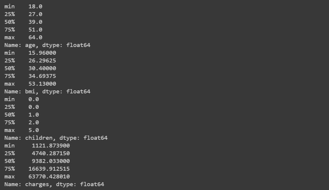
All the features are fine according to the numbers. ‘age’ feature is looking fine. ‘bmi’ feature is having the upper limit quite high. ‘children’ feature is fine and ‘charges’ feature is having a high range. Overall, the ranges of all the numeric features are fine to proceed forward.
To have a better understanding of the values within these features, visualization helps. So, plotting the data points on a graph with the help of a visualization library will let us know the distribution of the data points. Seaborn and Matplotlib are great such libraries for it.
sns.distplot(data['bmi'])
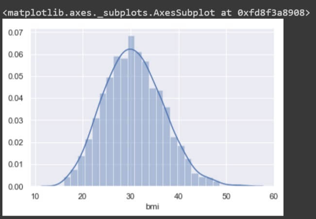
The plot is a uniform distribution of values in the ‘bmi’ feature. Thus, the feature is perfectly formatted with mean and median values close to each other.
Now, check other attributes similarly.
sns.distplot(data['age'])
sns.distplot(data['charges'])
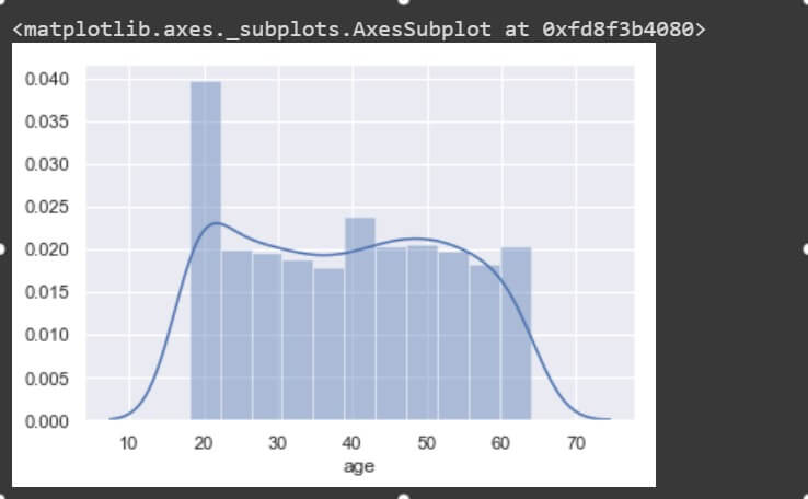
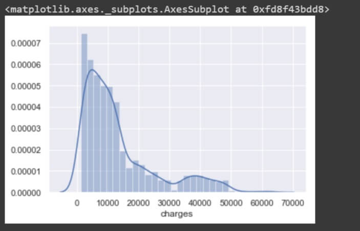
These two features are non-uniform in distribution and so are not expected to perform the best in a machine learning model. The mean and median values are values apart. As you can see the ‘charges’ plot is right-skewed (long tail on the right) it has its mean greater than its median.
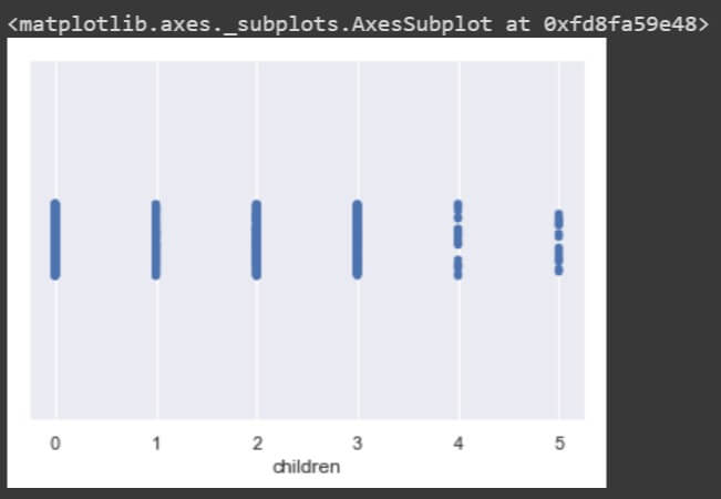
The other similar feature ‘children’ is also numeric in nature but as it has only a few unique values defined, it is better to treat it as categorical and plot a stripplot() than the distplot().
sns.stripplot(data['children'])
sns.stripplot(data['smoker'])
sns.stripplot(data['region'])
The stripplot() for individual dimensions are not giving much insights into the variable. Lets bring up a bivariate plot between each pair of dimensions with the help of pairplot().
sns.pairplot(data[['age', 'sex', 'bmi', 'children', 'smoker', 'region', 'charges']])
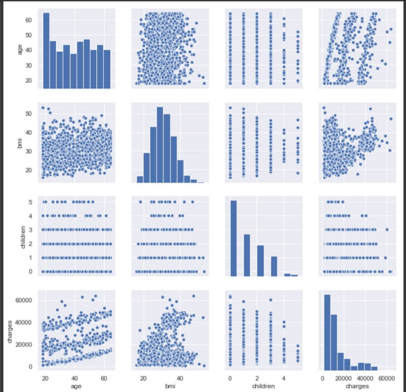
As there are only 4 attributes numeric in nature (int or float), the rest of them are not included in the pair plot. The diagonal plots represent distribution of the variable relative to itself. The plot between ‘age’ and ‘bmi’ does not indicate any relationship between them. The plot is more like a cloud and lacks direction.
Between ‘age’ and ‘charges’, there is no clear relationship, though there seem to be 3 lines of positive relationship between them. It means, there are 3 sets of charges which increase gradually with age.
No clear relation between ‘age’ and ‘children’ either.
The range of ‘bmi’ decreases as children increases, however there are some extreme values in ‘bmi’ for children value 5.
There is a little positive relation between ‘bmi’ and ‘charges’, although the plot is a cloud on initial values of ‘charges’.
The range of ‘charges’ decreases as the value of ‘children’ increases.
Do charges of people who smoke differ significantly from the people who don’t?
sns.stripplot(data['charges'], data['smoker'])
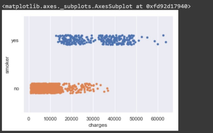
From the stripplot() between the two, there are certain values of ‘charges’ where there are people who smoke and there are people who do not smoke, but at the same time there are different charges for smokers and different charges for non smokers. People who smoke have high charges and the people who do not smoke have considerably very low charges.
So, charges do differ for people who smoke from the people who do not smoke but not significantly as there is some intersection of values for both types of people.
Does ‘bmi’ of males differ significantly from that of females?
sns.stripplot(data['bmi'], data['sex'])
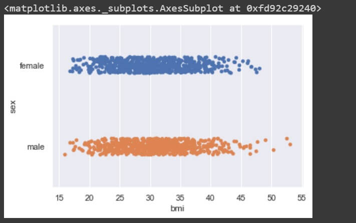
There is no significant difference in BMI for male and female genders, so no relationship exists between the two.
Is the proportion of smokers significantly different in different genders?
print("Total count of smokers is ", data[data['smoker']=='yes'].shape[0])
print("Total count of male smokers is ", data[data['smoker']=='yes'][data['sex']=='male'].shape[0])
print("Total count of female smokers is ", data[data['smoker']=='yes'][data['sex']=='female'].shape[0])
print("Proportion of smokers who are male is ", (data[data['smoker']=='yes'][data['sex']=='male'].shape[0])/data[data['smoker']=='yes'].shape[0])
print("Proportion of smokers who are female is ", (data[data['smoker']=='yes'][data['sex']=='female'].shape[0])/data[data['smoker']=='yes'].shape[0])
The output is,
Total count of smokers is 274
Total count of male smokers is 159
Total count of female smokers is 115
Proportion of smokers who are male is 0.5802919708029197
Proportion of smokers who are female is 0.4197080291970803
The proportions being 58% and 42% for male and female genders who smoke are not significantly different.
Is the distribution of ‘bmi’ across women with no children, one child and two children, the same?
sns.stripplot(data['bmi'], data[data['sex']=='female']['children'])
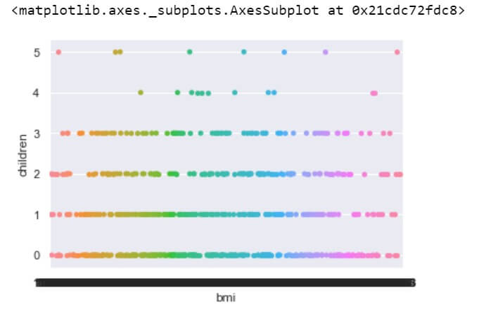
Yes, the distributions of ‘bmi’ are nearly same across women with 0, 1 or 2 children.
Conclusion
The visualization aspect of data helps us to identify how the data is distributed and how one dimension is related to the rest. Which plots to use depends on you and your preference. Identify the nature of the dimension and find out how it affects the other ones. The plotting of data points across dimension(s) is a lot like executing SQL queries and retrieving the results and here, the results when analyzed properly could help you gain valuable insights from your project.
